Did you ever design something and you thought it was dumb but others liked it? Well that is sort of how I feel about the latest designs I submitted to a fabric manufacturer. I realize they probably selected it among the designs I submitted because it showcased their fabric better than the other designs, which personally, I thought were better. Oh well.
What do you think?


Well that's it for this set of out takes. But don't worry, I have more!

What do you think?


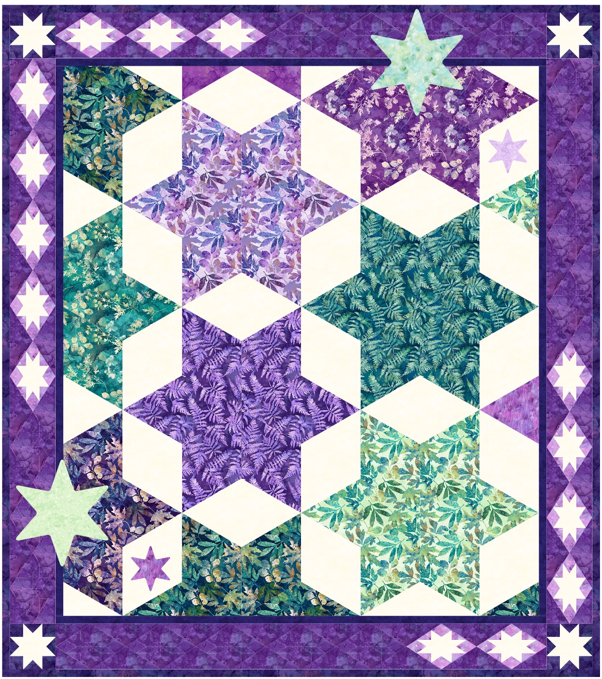
The pattern will come out later this spring, and it is called Star Shine. It really is a better name than the ones I originally (tongue in cheek) picked out: Purple Puffs and Teal Tufts. Kinda catchy, huh? They asked me to change the names.
I am pretty sure they selected them because they showcase the individual colorways of the fabric line: Teal Essence and Amethyst. Don't you love those names?
Here are a few of the other designs I submitted. I think they are more interesting, but may not showcase the fabrics as well. I continue to learn as a designer, working for the fabric industry.
I really like this next design, but I suspect they did not choose it because it was so busy, or possibly too difficult to make?

I thought this next one really showcased the lighter colors in each colorway, something hard to do when working with a specific line of fabric. I liked the soft shading.

I did this last one just because I like stars and think everyone else should also! Hahaha But the white background really makes a strong statement, especially with the border stars. I am sure they thought I was a lunatic for submitting this one.
Well that's it for this set of out takes. But don't worry, I have more!
Hi, Reeze -- I like the last design the best. I think the design of Star Shine but not with all-the-same fabrics. (I realize it's a fabric line promo -- but my style is scrappy so I would mix up the prints a lot.)
ReplyDeleteLove the colors, I really like them all, but I do like #4 and #5 the best. It is wonderful that you are able to design for fabric companies. Awesome work. Purple sage and teal we meet again.
ReplyDeleteI would day that #3 is my least favorite - the others I love. I will say that I usually don't particularly like quilts that have lavender in them but your first one caught my eye right away; I would definitely think about making it.
ReplyDeleteReally like the last one. Will you ever have the pattern available. BTW finished to Seminole Sampler from Houston. Thanks for the class.
ReplyDeleteI LOVE the first two because of the depth created by the ombre effect. To each his own....
ReplyDeleteI love the ones they chose, but Lunatic is amazing!!! (I'm sure that's not what you call it, but I just happen to think it's perfect!!). I love the way the ones they chose show off the gradient of the fabrics (now I want the whole line of both of them), but I want to make Lunatic!!!
ReplyDeleteI absolutely LOVE the first two. The gradients are so fun! I like the others as well, but I love the first two most.
ReplyDeleteI really like #4. The lighter colors set this block apart. Of course, I like the ones they chose, too. Good choices. Do not like #3. It's just too busy for me.
ReplyDeleteI really love the first two, the gradual transference of color is beautiful! Would buy this pattern in a heartbeat! Love the stars as well, can't help it...just love stars...
ReplyDeleteI love the second one with the soft shading.
ReplyDeleteI like #1 & #2 - from a longarm quilter's perspective, they'd give great opportunities for some awesome quilting!
ReplyDelete